The people. The craft. The character.
A family name.
A shared standard.
How we look, how we sound and what we stand for. A practical guide to bringing the CAF Heating brand to life, with the same care we bring to every home.
Get to know our brand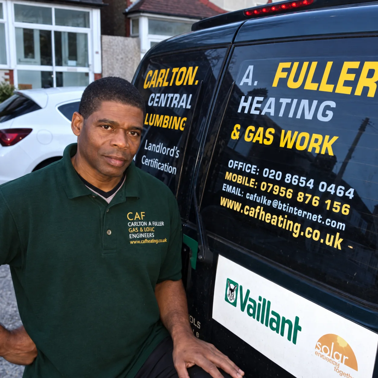
Good people. Proper workmanship.
Our brand starts with the people who turn up at your door. Everything else should feel like a natural extension of them.
Our purpose
Help local people feel
at home with their heating.
A name with people behind it.
Carlton, Simon and Stephen. Use our names, show our faces and speak with the warmth of a family business.
Care in the details.
Show the work. Explain the options. Let clear advice and real photographs make the case for our experience.
Local means something.
We are based in Horley and serve South London and Surrey. Write for the homeowners and landlords on our doorstep.
Who we speak to
Homeowners want to understand the problem, the cost and who is coming. Landlords need clear records, practical arrangements and confidence in the work. Both deserve a straight answer.
A familiar face.
Our green and charcoal CAF monogram carries the family name. Give it space, keep it recognisable and use the supplied artwork.
 CAFHeating
Make room for the name
Use the complete signature when introducing the business. Keep the standalone mark at least 48px wide on screen. At smaller sizes, check that the letters remain distinct.
Keep the original character
Use a light, quiet background. Keep the proportions and original colours. Avoid stretching, rotating, adding shadows or placing the mark over a busy photograph. On dark layouts, give it a light panel.
In writing, use CAF Heating, with a space. Use Carlton Fuller & Sons when telling the family story. The joined wordmark is a visual treatment only.
Grounded in green. Warm by nature.
Forest and paper set a calm foundation. Emerald connects us to the familiar CAF identity. Yellow draws attention to the next useful action.
RGB 19, 53, 39oklch(0.30 0.048 164)Our grounding colour. Storytelling, large headings and dark backgrounds.
Homepage / forestRGB 250, 246, 238oklch(0.975 0.012 85)A little warmth. Editorial backgrounds and space around our stories.
Homepage / paperRGB 248, 200, 0oklch(0.85 0.18 92)A clear next step. Primary calls to action and small moments of emphasis.
Brand / yellowRGB 31, 161, 112oklch(0.63 0.13 162)Our familiar green. Brand accents and supporting graphic elements.
Brand / emeraldRGB 3, 135, 91oklch(0.55 0.12 162)Links and small green text on light surfaces. The deeper everyday green.
Brand / emerald-strongRGB 189, 127, 87oklch(0.65 0.095 53)A nod to the craft. Fine details, illustrations and decorative accents.
Homepage / copperA starting balance, not a formula. Use dark ink on yellow, forest on paper and paper on forest. Reserve copper for decoration. OKLCH values match the website; HEX and RGB are rounded sRGB equivalents for design tools. Check the final text and background pairing for contrast.
Straight talking, with a human touch.
Inter does the everyday work. Georgia italic adds warmth to a few well-chosen words. This pairing comes directly from our homepage.
ABCDEFGHIJKLMNOPQRSTUVWXYZ
abcdefghijklmnopqrstuvwxyz
0123456789 £&?!
Proper care.
Personal service.
In good hands.
Care you can count on.
Clear advice. A familiar face. Heating that feels like home.
South London & Surrey / Since 1996
Use sentence case, comfortable line spacing and short paragraphs. Keep body copy to around 60-70 characters per line. Save italics for emphasis, not long passages. Inter is the website font; Georgia is a system font with a serif fallback.
Sound like someone you can call.
Our voice is warm, capable and plainspoken. Our tone changes with the situation, because a boiler breakdown and a friendly introduction need different words.
Warm
Speak person to person. Use “we” and “you”, natural contractions and the customer's own words.
Capable
Explain what happens next. Be specific about the work and honest about what needs checking.
Plainspoken
Use everyday language. Explain technical terms on first use and keep the useful answer near the top.
Considerate
Respect someone's time, home and budget. Let clarity do the reassuring; never promise what we cannot know.
The tone
Welcoming & useful
Someone is finding us for the first time. Introduce the people, explain the service and make the next step easy.
Hello, we're CAF Heating. Carlton Fuller and his sons look after boilers, heating and plumbing across South London and Surrey. Tell us what you need a hand with.
Welcome to the region's premier provider of innovative heating solutions.
Our writing habits
- British English: colour, centre, organise.
- Short sentences and active verbs.
- Sentence case for headings and buttons.
- Use full stops, commas or a spaced hyphen.
- Explain acronyms: landlord gas safety record (CP12).
Our judgement calls
- Gentle warmth is welcome; forced jokes can wait.
- Keep safety instructions factual and unambiguous.
- Give prices with scope and any conditions.
- Confirm availability before promising arrival times.
- Use real evidence for reviews, claims and credentials.
The right words, ready to use.
Start with what matters to the person reading. These core messages give us a consistent introduction while leaving room for a natural conversation.
Earn the claim
Use the family story, the service area and photographs of our work. Check prices, registration details, warranties and review scores before publishing. Avoid “the best”, “guaranteed savings” or invented testimonials.
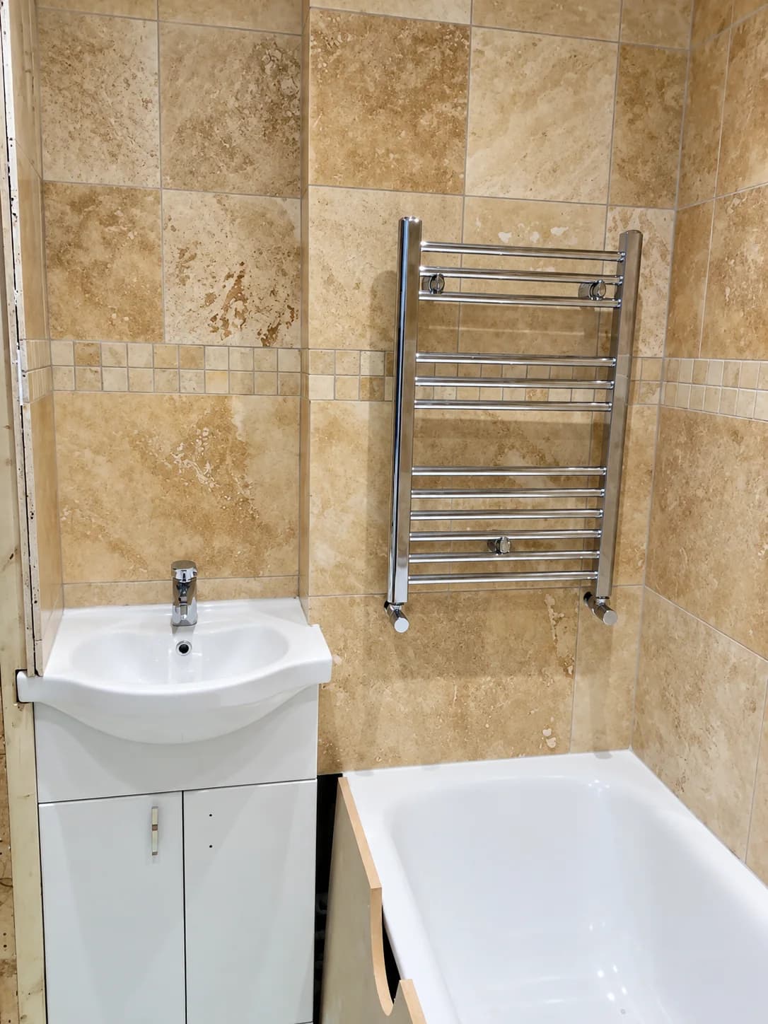
Real people. Real work.
Our photographs should feel like a visit with the team. The people, tools and homes in the frame tell the story better than a stock-photo handshake.

Keep it natural
Use available light, honest colour and considered crops. Show enough context to understand the work. Let green workwear and copper pipework connect the photographs to our palette.
Keep it respectful
Get permission before sharing someone's home or photograph. Crop out addresses, paperwork and private details. Describe each content image with useful alt text. Use compressed WebP files on the website.
Care, down to the small things.
Our layouts should feel as considered as our work. Give content room to breathe and make every interaction easy to understand.
Buttons & links
One clear primary action. Yellow with dark text. Secondary actions are simple, descriptive links.
Icons & details
Simple line icons, consistent stroke weight. Pair unfamiliar symbols with a label. Use fine rules to organise the page.
Space & shape
Work in a 4px spacing rhythm: 8, 16, 24, 32, 48 and 64px. Use generous section breaks, square editorial imagery and gently rounded controls. Keep shadows quiet.
Access & motion
Aim for 4.5:1 contrast for normal text and 3:1 for large text. Give controls at least 44px of touch space, visible keyboard focus and clear labels. Keep motion brief and respect reduced-motion preferences.
Make something that feels like us.
Use the original artwork and these guidelines as your starting point. Keep our name, colours and voice consistent wherever the brand appears.
 CAF brand markTransparent WebP / Website-ready artworkPNGOriginal logo artworkPNG / Original supplied logoCSSBrand colour paletteCSS / Copy-ready website colour valuesTXTMessaging & writing guidePlain text / Voice, principles and core copy
Before it goes out
- Does it sound like a person from our team?
- Are the details accurate and the claims evidenced?
- Is the logo clear and the text easy to read?
- Does the reader know what to do next?
A CAF Heating guide, informed by our website and family story. Editorial inspiration: Mailchimp's voice and tone guide and PostHog's writing principles.
Same family.
Same care. Everywhere.